New simpler design
New less bloated website design
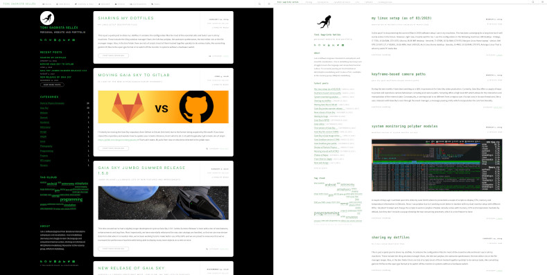
I’ve once again changed the design of the site to make it cleaner, more simple and above all, less bloated. I’ve removed a bunch of javascript code (for instance, MathJax is no longer loaded by the main template but by the actual pages that really need it). Also, I’ve simplified the color palette settling on a black on white scheme with green for links and titles.

Old (left) and new (right) design side-by-side. The new design is cleaner and more pleasant to the eye.
The new design also looks better on mobile screens, as I took some care of adapting the templates for pocket devices. Finally, I changed the home page from the blog summary listing to an introduction and welcome page, and added a full blog listing page containing a list of all blog post titles sorted by date.